Da is the symbol of the group and the spiritual totem of all Pengda people.
It symbolizes order, faith, action and ideal. The combination of the first letters "P" and "D" in the Chinese phonetic alphabet of "Pengda" has been transformed circularly, and the pulse runs through, showing a rigorous and orderly geometric aesthetics, which is like two signposts with clear directions and a building plane facing each other.
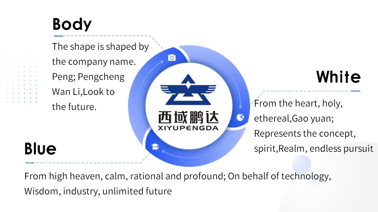
Blue, gold and titanium white are the main colors of the logo color system.
Blue, from the sky, is calm, rational and profound; Represents science and technology, wisdom, industry and an infinite future.
Yellow, from thick soil, warm, implicit and solid; Represents culture, foundation, emotion and a long past.
White, from the soul, holy, ethereal and lofty; Represents the concept, spirit, realm and endless pursuit.
The perfect shape of the outer circle, the inner side and the middle side means "the sky is round and the place is round", which contains profound China's traditional concept of the universe and the ideal of harmonious human settlement of "harmony between man and nature", which embodies Pengda's international vision of lofty aspirations and global mind.
The whole logo is full, steady, concise and powerful, which shows Pengda Group's unremitting pursuit to the high-end field of construction engineering and its corporate image of strict order, firm belief, bold action and grand ideal.